Friday, November 30, 2007

Comme Ci, Comme Ca


That was my favorite phrase when I was learning to speak French. Literally translated, it means, "as this, as that." To the French, it's a phrase that means "so so," as in mediocre ... as in today's project. As in, I'm just not that excited about it, and therefore don't have much to say.

Have a great Friday!

Supplies:
Paper: Whisper White, Real Red, and More Mustard card stock by Stampin' Up; soft sky designer prints paper by Stampin' Up!
Accessories: turquoise and mustard vinyl flowers by American Crafts; red felt flower by American Crafts, chipboard letters by Heidi Swapp and American Crafts, silver brads by Stampin' Up!

Thursday, November 29, 2007

Fab Color Combo, Part 2


When I said I was in love with this color combo, I really meant it. These little notecards started off from the remains of yesterday's card. I had played around with cutting out the image and popping it up on a colored background, but for yesterday's card, I ended up liking the image better just stamped onto white. The cut-out version was way too cute to throw away, however, so I put together the first of these little 3x3 notecards. Next thing you know, I had a set of four.

I love these little notecards, by the way. They're like little appetizers to whet your creativity. Betcha can't stop with just one :)

Supplies (all Stampin' Up! unless otherwise noted):
Stamps: Garden Silhouettes, Fine Lace background
Paper: Basic Gray, Bashful Blue, Certainly Celery, Celery designer prints
Ink: Basic Gray
Accessories: Bashful Blue and Certainly Celery markers, "ice" circle rhinestone brads, dimensionals, paper piercer, edge distressing tool, sponge dauber, gray taffeta ribbon, word window punch, 1 1/4" and 1 3/8" circle punches, circle cutting system and scalloped scissors by Creative Memories

Wednesday, November 28, 2007

Fab Color Combo


Are you just dying over this color combo from SCS's weekly Color Combo challenge? I could not wait to get the kids to bed last night, so I could get down to my craft room and PLAY! I've always loved bashful blue and certainly celery together. The gray breathes new life into this trusty combo! What I like about the colors is that they can work equally well for something on the elegant side, or something funky and hip, or even something sweet and baby-themed. They'd be great colors for weddings and anniversaries, and equally great for sympathy. I can't think of many color combos that versatile.

Supplies (all Stampin' Up! unless otherwise noted):
Stamps: Garden Silhouettes, Fine Lace background, Cute Converse
Paper: Basic Gray, Celery designer prints, Whisper White, Bashful Blue, Certainly Celery
Ink: Basic Gray
Accessories: Certainly Celery and Bashful Blue markers, gray taffeta ribbon, dimensionals, Ice circle rhinestone brads, various circle punches, sponge daubers, distressing tool, circle cutting system and scalloped scissors (Creative Memories)

Tuesday, November 27, 2007

Guava Butterfly


I wanted to play around a little more with the Pomegranate, Celery and Guava color combo I used on yesterday's card. I was also trying to play along with Jen del Muro's Sketch For You To Try from this past weekend, but I just couldn't make the tilted main image panel work on this card. Very frustrating since I fell on my face with her sketch from last week, too. I'm waiting to post that one until I can get my hands on the vomiting smiley I saw on Cammie's Blog. Too funny, even though her project in question was totally adorable!

Supplies (all Stampin' Up!):
Stamps: Priceless
Ink: Groovy Guava, Purely Pomegranate, Certainly Celery, White craft
Paper: Whisper White, Groovy Guava, Purely Pomegranate, Celery designer prints
Accessories: crystal effects, glitter pen (Sakura), miniature flower punch (from Michael's), Groovy Guava double-stitched ribbon, ticket corner punch

Monday, November 26, 2007

Delighted in TexasGrammy


I'm loving SCS's Featured Stamper Challenge. I get to spend time discovering, or rediscovering, a talented stamp artist. And when it comes time to sit down and stamp, the hard part is already done so I don't have to think much. Makes for a quick and easy stamping Sunday!

This weeks's stamper is TexasGrammy, aka Beverly. Be sure to head over and take a peek at her awesome gallery. For the challenge, you get to pick a card to CASE, and then "make it yours" by changing at least two things. I chose this card from her gallery because it's delightful (sorry, couldn't resist!), and because it gave me a good reason to mount and use my free Delight in Life set from Sell-A-Bration way back in January.

I kept her layout and stamp set choice, and then made these changes:

1. slightly different colors
2. changed white stamped background to Groovy Guava
3. added two more cut out flowers
4. added faux stitching
5. added silver ribbon
6. added sparkle with Sakura glitter pen (you might have to click the photo for a close-up to see this... I traced over the sentiment and along the outlines of the flowers)

Supplies (all Stampin' Up!):
Stamps: Delight in Life, Canvas
Ink: Jet Black Staz-On, Certainly Celery, Purely Pomegranate, Groovy Guava, VersaMark, White craft
Paper: Purely Pomegranate, Certainly Celery, Whisper White, Groovy Guava, watercolor paper
Accessories: aqua painter, paper piercer, silver ribbon, white gel pen, key tag punch

Sunday, November 25, 2007

Penny Black Pine Cones

I noticed some questions about subscriptions and feeds from a few recent comments. I added a FeedBlitz subscription link, so feel free to sign up there if you like. I admit I don't know a lot about it, so if I messed up any existing feeds, I'm sorry!

I also saw the coolest thing the other day. If you haven't seen the spinning dancer optical illusion, check it out. Supposedly, if you see her spinning clockwise, then you are more right-brained; and if you see her spinning counter-clockwise, then you are more left-brained. Which way do you see her spinning? Or maybe you see both?

And now for some stamping ...


This is another possibility for my holiday cards this year. I've used a Penny Black Pine Cone stamp I found a year or two ago, and the layout is CASE'd from this super sleek card by Kristina Werner.

Once again (I hope I'm not in a rut), I colored the image with markers, then overstamped in VersaMark so I could clear emboss the whole thing. I've put a Happy Holidays greeting on it, but I think it would also work well for any occasion that requires a masculine card (even with the ribbon). Those masculine cards are always challenging little buggers. For me, anyway :)

Supplies (Stampin' Up! unless otherwise noted):
Stamps: Pine Cone (Penny Black); Riveting, Canvas
Inks: Always Artichoke, VersaMark
Paper: Always Artichoke, Mellow Moss, Chocolate Chip, Very Vanilla
Accessories: Always Artichoke and Chocolate Chip markers, clear embossing powder, paper piercer, sponge daubers, dimensionals, pewter jumbo eyelets, Crop-A-Dile, chocolate wide grosgrain ribbon, slot punch, 1/2", 1 1/4", and 1 3/8" circle punches

Saturday, November 24, 2007

Mistletoe Do-Over


That whole mistletoe thing was buggin' me, so I got to playing around again. Better? Worse?

I like the pop of the white with red berries (see previous post), but I'm kinda leaning toward this one with the white berries, and here's why.

First, it really looks like mistletoe!

Second, in my blog wanderings yesterday (*see note below), I saw two cards that used something called liquid pearls. Did not know about that nifty little product! When I was putting together the Elegant Silhouette card yesterday, I was wishing I had miniature pearl beads to glue onto the scallops, but had to settle for the white gel pen. How much easier would the liquid pearls be (than beads, that is)? And now today for the mistletoe? How flippin' awesome would liquid pearls be for the berries?! Can't wait to get some and try it!

*About my blog wanderings yesterday ... Allison from Stampin' When I Can linked me up on her blog as her Inspiring Blog of the Week. I was so flattered. The cool thing was that a bunch of new people stopped by yesterday and left comments (thank you!), so I had the pleasure of checking out all their blogs, too. What fun!

Pretty much the same supplies as the previous post. I colored the berries with a white gel pen. It might be hard to see, but I also stamped the Linen background in River Rock on the River rock circle, then sponged the edges for a little dimension.

Christmas Card '07?


I finally felt motivated to start playing around with Christmas card designs. I am totally loving the square card lately. If I'm gonna have to increase postage for the thickness and even the weight, I might as well make it square while I'm at it, right? (I hope that doesn't make it triple postage!) I used a design from a fall card I made last month. It also looks a lot like the Mojo Monday sketch challenge on Poetic Artistry this week, except my image panel is circle instead of square. I wonder if I can still enter ...

I made my own background paper using the same stamp as the main image. First I stamped a time or two in Versamark, then a couple times in Vanilla ink for the Pomegranate base and White ink for the River Rock base (the Vanilla really didn't show up on the River Rock). I think I'll order a pack of the Holiday Harmony designer paper to speed things up a bit.

But here's the thing ... the image is supposed to be mistletoe, yes? And mistletoe berries are white, right? Which makes this card wrong, huh? Is there *anything* else the image could be, so that I can keep my red berries?

Supplies (all Stampin' Up!)
Stamps: Peaceful Wishes, Party Punch (hostess), French Script background
Inks: Always Artichoke, Purely Pomegranate, VersaMark, White craft, Vanilla craft
Paper: Always Artichoke, Purely Pomegranate, River Rock, Chocolate Chip, Whisper White
Accessories: Rose Red, Always Artichoke, and Chocolate Chip markers; clear embossing powder; slot punch; pomegranate satin ribbon; 1 3/8" circle, 1/4" circle, and 1/2" circle punches; dimensionals; antique brass brads.

Friday, November 23, 2007

Elegant Silhouette


I had so much fun putting together this card for SCS's Sketch Challenge #151.

For the main image, since there isn't a Purely Pomegranate marker, I inked the whole image from the Purely Pomegranate pad, then used the brush tip of a Basic Black marker to color over the leaves and stems. After stamping, I used a stamp positioner to overstamp the image in VersaMark ink, so that I could clear emboss the whole thing. (Do not try this without a stamp positioner, LOL!) I like the shiny elegance it gives to the card.

For the background, I ran the black card stock through my Cuttlebug using the textile folder. Something about it was still too "plain" for the shiny main image, so I tried adding VersaMark ink to the raised portions (I used a brayer), so that I could clear emboss. It worked!

I also added one of the stick pins from the Pretties kit. Who knows if this is the "right" way to use this kit ... all I know is it was a shame to see that whole kit just sitting untouched since July, when it showed up in the new catalog and I *had* to have it! I'm saying "no" to hoarding :)

Supplies (all Stampin' Up!:
Stamps: Garden Silhouettes
Inks: Purely Pomegranate, VersaMark
Paper: Purely Pomegranate, Basic Black, Whisper White
Accessories: Basic Black marker, clear embossing powder, paper piercer, corner rounder (for scallops), white gel pen, pomegranate satin ribbon, word window punch, black brads, Pretties kit, Cuttlebug textile embossing folder

Thursday, November 22, 2007

Happy Thanksgiving


Thanks to all of you who stop by my blog and for all the encouraging comments you leave. And to those of you with blogs, thank you for sharing your creativity and knowledge. You all are such an inspiration to me. Happy Thanksgiving! However you celebrate, I wish you a joy-filled day.

Supplies (Stampin' Up! unless otherwise noted):
Stamps: Time Well Spent, Thanks by Heidi Swapp
Paper: Chocolate Chip, watercolor paper
Inks: Jet Black Staz-On, More Mustard, Really Rust, Ruby Red, VersaMark
Accessories: 5/8" Old Olive grosgrain ribbon, Clear Embossing Powder, Old Olive brad, dimensionals, glitter pen (by Sakura)

Wednesday, November 21, 2007

Pink and Green Snowflakes

SCS's color challenge this week is Pretty In Pink, Wild Wasabi, and Whisper White, with added encouragement to make a holiday card. I wouldn't have thought to use these for a Christmas card, but I love how they turn out together. A great challenge!

I also used Beate's Weekend Sketch Challenge #28.


Supplies (all Stampin' Up!)
Stamps: Snow Burst, Designer Label, Snow Flurries
Ink: Wild Wasabi, Pretty In Pink, White craft
Paper: Wild Wasabi, Pretty In Pink, Whisper White
Accessories: Designer label punch, 1" circle punch, 1/2" circle punch, slot punch, ticket corner punch, Pretty in Pink brads, Wild Wasabi double-stitched ribbon, Cuttlebug Snowflakes embossing folder

Tuesday, November 20, 2007

Is Less More?


One of my absolute favorite designers right now is Kristina Werner. She rocks! Her style is so lean and clean. Very minimalist. I compulsively check her blog to see what new stuff she's been working on, and everytime, without fail, I see a new project and my jaw drops. She takes "less is more" to a completely different level. Check out her work on her blog: kwernerdesignblog.

I'm usually into more layers, more embellishments, more "stuff," so I challenged myself to make something in the "less is more" style. I tried to stick with basic stamping and a few (hopefully) well-placed "extras," like the piercing, ribbon, glitter, and pop-dots.

Supplies (Stampin' Up! unless otherwise noted):
Stamps: Time Well Spent
Inks: Jet-Black Staz-On, Certainly Celery, Apricot Appeal, Bashful Blue
Paper: Pretty In Pink, Whisper White, Watercolor paper
Accessories: aqua painter, dimensionals, apricot grosgrain ribbon, celery grosgrain ribbon, blue gingham ribbon, paper piercer; markers (Apricot Appeal, Certainly Celery, Bashful Blue, and Pretty in Pink), glitter gel pen (by Sakura)

Oh, and here's something exciting. I'll have a card in the April 2008 issue of CARDS!

Monday, November 19, 2007

November Teacher Appreciation


This is what the teachers and staff at my son's elementary school will be receiving tomorrow from the PTO. I used Qbee's Peek-A-Boo box, which I discovered a few weeks ago in one of the Technique Lover's Challenges on SCS. Awesome little boxes, but sixty-four is a LOT to make!

Supplies (all Stampin' Up!):
Stamps: Shapes & Shadows, All-Year Cheer (I, II, or III, not sure?)
Inks: Really Rust, More Mustard, Old Olive, Pumpkin Patch spectrum, Chocolate Chip
Paper: Very Vanilla, More Mustard, Old Olive, Really Rust
Accessories: acetate, 1 1/4" punch (for the inside), craft knife (on the inside), lots of M&Ms ;)

See my Halloween box here. And a whole bunch more here. Get the pattern and instructions here.

Last month's PTO teacher gift was a Halloween sour cream box.

Sunday, November 18, 2007

Featured Stamper: Papermoon04


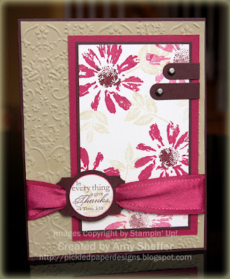
Today's Featured Stamper on SCS is Papermoon04. I've admired all the creations in her gallery for a while now, so it was fun to spend the extra time looking through her gallery and picking something to CASE. I chose this card of hers because it uses so many of my favorites: flower stamps from Petal Prints, the "Textile" cuttlebug embossing folder, and a great (and timely) sentiment that is part of the Happy Harmony stamp set.

The changes I made are:
1. color scheme
2. used the Designer Label punch behind the sentiment
3. used two word window punched strips in place of the three brads on the main image panel.

The elements I kept:
1. layout
2. embossed background
3. stamps

Supplies:
Stamps: Petal Prints, Happy Harmony
Inks: Purely Pomegranate, Chocolate Chip, River Rock
Paper: Purely Pomegranate, Chocolate Chip, River Rock, Very Vanilla
Accessories: word window punch, vintage brads, designer label punch, 1" circle punch, pomegranate satin ribbon, Cuttlebug "textile" embossing folder

Inspired By ...


I've been following along with the weekly Inspiration Challenges on Splitcoast, and was finally inspired to jump in and participate. Each week you get an image of a little something that you're to use as inspiration. Yesterday's piece was a beautiful jacket from Coldwater Creek.

I used my new stamp set Time Well Spent, which all active demonstrators just received FREE from Stampin' Up! Gotta love that. Watch for it in the upcoming Spring/Summer Collection, the new catalog that will be available January 1. It's a Level 3 hostess set. Wow! Thank you Stampin' Up!

Supplies:
Stamps: Time Well Spent
Paper: Certainly Celery, Basic Black, Whisper White
Inks: Jet Black Staz-On
Accessories: Taken with Teal, Certainly Celery, Pink Passion and Lovely Lilac markers; ticket corner punch, 1/8" circle punch, dimensionals, glitter gel pen (Sakura)

Friday, November 16, 2007

On Second Thought ...


I really couldn't sign off tonight with a post about braces. I put this together for today's Ways To Use It Challenge on SCS. The challenge was to use a "unique" brad. Something other than the ubiquitous little mini-brads.

I found the decorative metal brad in my "Metallics" drawer. (My embellishments are organized by color, a la Stacy Julian and Big Picture Scrapbooking. It is a FANTASTIC system!)

Supplies (all Stampin' Up! unless otherwise noted):
Stamps: Doodle This, Happy Everything
Inks: Jet Black Staz-On, Certainly Celery, Apricot Appeal
Paper: Whisper White, Watercolor paper, Basic Black, Certainly Celery, Apricot Appeal
Accessories: brad (Making Memories?), aqua painter, paper piercer

Thursday, November 15, 2007

Brace Yourself

This morning, I had the joy of getting braces on my teeth. I'm too old for this. I'm in my upper 30s, for crying out loud. "Upper 30s," who am I kidding? Any higher up and I'll be out of the 30s altogether :D

Just wanted to post to say I likely won't have a project to show today, as it's already 9 pm and I'm still brushing and flossing my lunch out of my brackets. The crazy thing is ... my teeth are straight already. But tipped. I think it's called "lingual version with a deep bite."

I think it's called "mid-life crisis," Amy Sheffer variety. Cheaper than a fancy sports car; less painful than liposuction ;)

Wednesday, November 14, 2007

Wild + Soft = Delicious

A few weeks ago, I saw a beautiful gift card holder on Inkin' It Up, the website of the fabulously talented Kendra Giles. Her color combo, Wild Wasabi and Soft Sky, was so delicious and unexpected.

Here's my take:


Supplies (Stampin' Up!, unless otherwise noted):
Stamps:
Doodle This, Sincere Salutations, Linen
Inks: Jet Black Staz-On, Wild Wasabi, Soft Sky
Paper: Watercolor paper, Basic Black, Wild Wasabi, Soft Sky
Accessories: aqua painter, sponge dauber, crystal effects, black polka dot ribbon (manufacturer unknown, got it at Michael's), dimensionals

Tuesday, November 13, 2007

Almost Forgot ...


... to make a Happy Anniversary card for my husband. (I didn't forget the anniversary part, just the card part!)

So here's to my awesome spud, er, I mean, stud -- congratulations on fourteen years of marriage today!

Supplies (all Stampin' Up!):
Stamps: Stew Pot Pals (retired), Canvas, Itty Bitty Backgrounds
Ink: Basic Black, Basic Gray, Creamy Caramel, River Rock, Mellow Moss, Regal Rose
Paper: Basic Black, Basic Gray, River Rock, Mellow Moss, Watercolor (140 lb cold press)
Accessories: aqua painter, paper piercer, pewter jumbo eyelets, crop-a-dile, dimensionals

Credits: A few weeks ago, there was a color combo challenge on Splitcoast -- river rock, basic gray, and basic black. Until then, I saw no reason to have yet another neutral, especially not gray. But when I saw all the wonderful creations with this combo, I was itching to play, too, and I knew Basic Gray was going to find its way into my craft room. I absolutely love it!

Letters to My Daughter


It's been more than a week since my daughter's fourth birthday, so I figured I ought to go ahead and write her annual birthday letter before I forget. I try to do this for each child each year around their birthday. That way even if I get no scrapbooking done at all (unlikely), I'll at least have the annual letter covering the year's high points.

I got most of the idea for this project way back a long time ago in Splitcoast's Fan Club gallery. In September 2004, "Dirty Girl" Melanie Muenchinger (melmel on SCS), posted something very similar. (Sorry, I can't include a link to it, because the Fan Club is for SCS members who support the site with a small annual donation. If you're a Fan Club member, check it out. If you're not, subscribe! :D)

Melanie got the idea from another home party company that focuses on preserving heritage. The concept is that you write the child a letter each year on his or her birthday, then shortly before the 21st birthday, you begin giving him or her the letters, one at a time, ending with the final letter at 21.

Now the birthday letter idea wasn't new to me, but the whole "packaging" part was. I know myself well enough to realize I'll have a much better chance of being a faithful letter writer if I have a pretty little box and matching cards. Melanie's execution of the concept was absolutely phenomenal, and it stuck in my head and rattled around for a year before I did anything with it. Then, a couple of years ago, when the altered lunch tin was so hot, I knew it was the perfect container for this project, and I was finally inspired to make one.


I heeded Melanie's advice not to make it too babyish, since my daughter will be an adult when she gets the letters. I figured I couldn't go wrong with florals, but I still didn't want the traditional pinks and purples. Blue and black might seem like an odd choice for a girl and for flowers, but I really like how it came together.

The biggest change I'll probably make is to keep writing letters into their adult years, or at the very least, wait until well past 21 before I hand them over. Sorry, I just don't think most 21-year-olds have the maturity to know the value of something like this! Maybe I'll give them their letters after they have children of their own.

The biggest fear I have is that this will be "ugly" in another 15-20 years! You know, like the avocado appliances of the 70s? Most of my stamping projects from as little ago as two or three years, even those that were my absolute favorite, now seem dated. I have considered just making something "current" each year. That way the cards can grow and change with the child. And I may still do that. It's just that for now, I don't want the whole "first I've gotta make a card" to be yet another reason to procrastinate at letter-writing time :) Know thyself ... ;)

Anyway, I hope you enjoy today's project, even if I am posting something from two years ago!

Supplies (all Stampin' Up, unless otherwise noted):
Stamps: Looks Like Spring
Inks: Bashful Blue, Basic Black, Barely Banana
Paper: Bashful Blue, Basic Black, Barely Banana, Whisper White
Accessories: black gingham ribbon, Spring Bouquet punch, lunch tin (from Provo Craft)

Monday, November 12, 2007

Long-Time Friend Sketch X2

I finally broke out Long-Time Friend, one of those stamp sets I just had to have when it was available. I'm still in love with it, especially now that I've used it.

This first card uses Beate's Weekend Sketch Challenge #27:


The second card uses Jen del Muro's Sketch For You To Try:


And the third is just me doing my own thing. Yea, I do that, too, from time to time ;) Betcha were wondering with all these sketch challenges.


Supplies (all Stampin' Up!):
Stamps: Long-Time Friend, Weathered (background), Canvas (background)
Paper: Mellow Moss, Elegant Eggplant, Basic Gray, Watercolor (140 lb cold-press)
Inks: Mellow Moss, Elegant Eggplant, Basic Gray, Black Staz-On, Lavender Lace, Really Rust, Close to Cocoa, Regal Rose, Always Artichoke
Accessories: gray taffeta ribbon, pewter brads, pewter hodgepodge hardware, paper piercer, photo corner punch, stamping sponges, sponge daubers, dimensionals

Saturday, November 10, 2007

Burgundy, Bayou and Sky


Last night was my first time stumbling upon this cool color combo. I happened to have these three packs lying on my desk from unrelated projects, and thought they looked so pretty together. What do you think?

For this card, I used a sketch I found on Julia Stainton's blog, Belle Papier. The large flower is from the Pretties kit. For the flower center, I used the rhinestone brad/jumbo eyelet pairing I've been seeing a lot of lately on Beate's blog, fresh & fun. The only stamping was the swirly flourish thingie from the Priceless stampset. The rest of the card is just layering and paper piercing. I keep resisting the urge to add more to this card for fear of ruining it :)

Supplies (all Stampin' Up!):
Stamps: Priceless
Paper: Blue Bayou, Whisper White, Bravo Burgundy, Soft Sky
Ink: Whisper White
Accessories: Rhinestone brad ("Ice"), pewter jumbo eyelet, pretties kit, crop-a-dile, paper piercer, 1" circle punch.

Friday, November 9, 2007

A Pocketful of Amethyst


Went back in the craft room for a do-over of the "thinking of you" card for my friend. This is *much* more what I was thinking of. I decided to go with a horizontal pocket card, which Splitcoast's Technique Lover's Challenge this week. I used some new designer prints paper in Almost Amethyst. Each pack comes with twelve different monochromatic paper designs. Super easy to work with!

Very little stamping on either the outside or the inside, shown here:


Supplies (Stampin' Up!, unless otherwise noted):
Stamps: Simply Said
Paper: Almost Amethyst, Whisper White, Amethyst Designer Prints
Ink: Basic Black, Almost Amethyst
Other: Corner rounder, paper piercer, white gel pen, word window punch, rhinestone circle brads in "Ice," Amethyst marker, stitched ribbon from the Sweet Shop collection (retired), sheer white poka dot ribbon (source unknown)

Thursday, November 8, 2007

Priceless


You know when you're making something and it all just comes together right away? And you're left feeling totally satisfied that you made something really cute and you hardly spent any time doing so?

This was NOT one of those times :)

I set out making a card for a friend who was recently diagnosed with breast cancer. I wanted something soft and cheery, so I started with a favorite color combo of mine -- celery green, rose, and baby blue. After too many iterations to count, I wound up with something that, although I like it, is no longer my idea of a card suitable for this occasion. (Too much black, you know?)

So back to the craft room to try again. Bummer ;)

In the meantime, I hope you enjoy this "outtake."

Supplies:
Stamps: Priceless
Ink: Basic Black, Regal Rose, Rose Red, Whisper White craft
Paper: Whisper White, Bashful Blue, Certainly Celery, Basic Black
Accessories: Black gingham ribbon, slit punch, white gel pen, paper piercer, dimensionals

Wednesday, November 7, 2007

Forgot the Best Part!

When I posted last year's Christmas card, I totally forgot the best part -- the inside! (Thanks, June, for the reminder!)


Those who paid any attention got the advance news that my husband and I were expecting again. I signed the cards, "Love, Terry, Amy, and our three little elves," and then included three stockings. The first two were labeled with our children's names, and the third, a blue one (for baby boy), said "Due 4/25/07."

The crazy thing is you wouldn't believe how many people never even noticed the third stocking! And those that did notice asked if we knew whether the baby was a boy or a girl. Oh well, holidays, right? You get so many cards maybe you don't really pay attention to detail.

My second design last year (after I bailed on this one) was made with the Snow Flurries set and on the inside I wrote "Love, Terry, Amy, and our three little snowflakes," then stamped and labeled the snowflakes the way I had done the stockings. Either way, it was a really fun way to tell our more distant friends and family our good news.

Looking for Some Mojo


Had a few minutes in the craft room while my little miss was making a card for one of her friends, and thought I'd try one of the several sketch challenges I had lying on my desk.

This one is from Julee's Mojo Monday sketch challenge. Check out her blog, Poetic Artistry, to see the actual sketch this week. She's offering some blog candy to go along with it, so give her sketch a try by Saturday and you'll have a chance to win a *free* Verve Visual stamp set. Sounds pretty good to me!

Supplies (all Stampin' Up!):
Stamps:
Heartfelt Thanks, Lexicon of Love (retired), Canvas, Print Pattern
Paper: Pixie Pink, Pink Passion, Whisper White, Basic Black
Ink: Pink Passion, Basic Black
Accessories: black gingham ribbon, hot pink wide organdy, black grosgrain, 1/8" punch, pewter hodgepodge hardware, white gel pen

Tuesday, November 6, 2007

The Mad Cutter

That's me ... madly cutting cardstock for a card buffet I'm having Friday. And not-so-patiently awaiting another shipment of additional materials I need. But that's not why I post this evening.

As I'm preparing all these materials for others to make their cards, I'm thinking if I can plan other people's cards in October and November, just maybe I could (and should) start on my own cards sometime before, say, December 22 (which I did three years ago! Crazy.)

Last year, I was good. I started WAY early. Even still, I could only complete about 40 of this design ...


All that watercoloring and hand-trimming? So fun, but ridiculously time-consuming to mass produce. I honestly love to pour my heart and soul into my Christmas cards and usually don't mind the mass production part at all, but last year I really thought I'd break out in hives if I ever touched watercolor paper again!

I tell you, though ... the pressure is on. Can I top this this year?

Supplies:
Stamps: Merry Elves (retired), Cute Converse (retired), Itty Bitty Backgrounds, Snow Flurries
Paper: Cranberry Crisp (retired), True Thyme (retired), Bashful Blue, 140lb cold press watercolor paper, Holiday Thyme designer paper (retired)
Inks: Cranberry Crisp, VersaMark, Jet Black Staz-On, Old Olive, True Thyme, Bashful Blue, Night of Navy, Summer Sun, Blush Blossom
Accessories: Cranberry and Thyme stitched ribbon, iridescent ice embossing powder, ticket corner punch, hobby blade, silver brads, aqua painter, crystal effects

Monday, November 5, 2007

Featured Stamper Challenge


Remember my post a while back thanking fellow stamper Jimmi Mayo for her kind words and encouragement when I had just started this blog? I was thrilled to see that she is this week's Featured Stamper on Splitcoast, and just had to play along! The Featured Stamper challenge is fun. You find a card in their gallery and CASE it (copy and share everything). But you have to change at least two things to make it your own.

I chose a gorgeous card of hers that uses Heartfelt Thanks, one of my favorite sets that, sadly, has been collecting dust most of this past year. You can see her original card here. I used the same stamps, but changed the color scheme. I dry embossed, like she did, but I used a different Cuttlebug embossing folder. And I used ticket punched corners instead of brads. Last, I went over the main image with the speckle stamp from Itty Bitty Backgrounds using metallic silver ink.

This is pretty enough, I'm not complaining, but I like hers SO much better! You have to check it out. Stay a while and check out the rest of her gallery, too.

Supplies:
Stamps: Heartfelt Thanks, Warm Words, Itty Bitty Backgrounds
Paper: Whisper White, Night of Navy, Mellow Moss, Bashful Blue
Inks: Bashful Blue, Mellow Moss, Night of Navy, Encore Silver Metallic
Accessories: ticket corner punch, photo corner punch, navy wide organdy ribbon, silver cord, Cuttlebug "textile" embossing folder

Sunday, November 4, 2007

My Extra Hour


The tiaras and wands were decorated, the games were all played, the gifts all opened, and "the cake" (now a mere shadow of its former glory, by the way) eaten ... with time left over to stamp last night (thanks to the time change)!

This card is for Beate's Weekend Sketch Challenge #26. Thanks to my upline, Sue, for encouraging me to see the Dashing designer paper line as more than just Christmas paper. I used it and the coordinating colors as the basis for this card of encouragement.

For the sentiment, I used my aqua painter to add a color wash in River Rock. I went back in and highlighted certain words with Real Red, again with the aqua painter.

Supplies (all Stampin' Up!):
Stamps: Priceless, Friendship Flowers
Inks: Old Olive, Very Vanilla, Real Red, River Rock
Paper: Old Olive, Very Vanilla, Real Red, Dashing designer paper
Accessories: Word Window punch, olive brads, 2-way glue pen, dazzling diamonds glitter, aqua painter, paper piercer

Friday, November 2, 2007

Tomorrow's the Day ...

... my little girl turns 4! Guess what we did all day? This ...


Crazy, huh? I found a bunch of cool castle cake ideas online and went to Michael's in search of just a few things ... rolled fondant and some sprinkles. But while we were there (you crafters know how this story goes, right?) ... we found some OTHER things ... like this very cool castle cake kit! It was $20, but I had the coupon, so I got it for $12. I figured I couldn't buy a cake that cheap, even after adding in the cake itself and the frosting. And why reinvent the wheel, when here was the very cake I was out to make?

Like so many endeavors, it really wasn't that simple. Three trips later, I finally had everything I needed ... all the decorating tips, the flower cutters and foam mat for the fondant flowers, meringue powder for the royal icing, etc. I don't even want to know what this cake actually cost!

It was reminiscent of my first Stampin' Up party ;) I was supposed to make cards with just stamps, ink, and paper. Yea, right.

As a wise, and honest woman once said (or was it her husband?), "Buying stamps to save money on cards is like buying a yacht to fish to save money on groceries."

Thursday, November 1, 2007

Challenging Color Challenge


Splitcoast's color challenge this week is Tempting Turquoise, So Saffron, and Real Red. I didn't think there was a way to make a decent card with that combo, but I did the challenge anyway, and I actually like the card!

Supplies:
Stamps: Doodle This, Three For You punch box (thinking of you)
Inks: Tempting Turqoise, Real Red, So Saffron, Basic Black
Paper: Watercolor paper, Whisper White, Real Red, So Saffron, Tempting Turquoise
Accessories: turquoise grosgrain, apricot grosgrain (close enough to saffron), pewter hodgepodge hardware, corner rounder, paper piercer, turquoise and red brads, aqua painter, crystal effects