Saturday, May 16, 2015

Birthday Celebration - SFYTT


Hi there, it's my turn to play along with Reverse Confetti's May Sketch For You To Try. Have you tried out this sketch? If not, there's still plenty of time. The deadline is noon CST on May 29.

Here's the May sketch:


I stayed pretty true to the sketch this month. The main panel is a Let's Celebrate Quick Card Panel that I trimmed down slightly. I added a few Star Garland die-cuts and a birthday sentiment from Fancy Words Confetti Cuts die set, as well as lots and lots (and lots) of clear sequins.


The two banners were die-cut using the new Stitched Flag Trio.


I wanted to maintain a lot of white on this card, so for that left vertical background strip, I used a piece of vellum. Both the vellum and the card base underneath have a little touch of embossing paste.


Thanks so much for stopping by, and I hope your weekend is amazing!


PAPER: white, teal, orange, bright pink card stock; Let's Celebrate Quick Card Panels

OTHER: white embossing paste, stencil, vellum, clear sequins

Friday, May 15, 2015

Papertrey Ink May Release in Review

It's release day at Papertrey Ink! All of the new products the team has been featuring the past week will be available for purchase tonight at 10 pm EST.

I have a few more projects to share today from this fantastic release. Warning -- lots of photos!

First up, a look at Dawn's latest addition to the Enclosed line: Enclosed: Star. I did something a little different with this set, and made birthday candles! It all started when I was brainstorming Petite Places: City Station ideas and happened to notice that one of the star detail images in Enclosed: Star looks like a flame.


The colorful chevrons on the candles were stamped with Noted.


The background panel was die-cut with the largest Stitched Rectangles die. Love the look of those stitching holes!


The sentiment components are all from the Enclosed: Star stamps and dies. I just trimmed out the word "super" from the die-cut.


I attached a tiny bit of linen thread to make the candle wicks.


This next card features Center Style: Masculine stamps and dies, as well as the new Three Piece Suit patterned paper collection. What a great manly look to these products! 


I stamped and layered some of the Center Style: Masculine decorative die-cuts, then added a two-color sentiment from Keep It Simple: Father. The "DAD" up at the top and the row of tiny Soft Stone dots at the bottom are both from last month's Pencilgrams set.


On the inside, I stamped an arrow pattern in Soft Stone using one of the images from Center Style: Masculine. The sentiment, from Tucked In: Father's Day, is stamped in Enchanted Evening. Last I added more of those tiny dots from Pencilgrams, this time in Smokey Shadow.


We can't have Center Style: Masculine without a feminine version, can we? Love the gorgeous shape in Center Style: Feminine! I had some plaid left over from my Second Helping of Sunshine/Plaid Builder project earlier in the week, and used a strip of it here.


The Center Style: Feminine decorative panel was die-cut from Melon Berry card stock. The filigree ends are each stamped with an image from Center Style: Feminine. A piece of large polka dot Sheer Basics Vellum overlays a portion of the main panel.


On the vellum, I stamped a Watercolor Talk sentiment in VersaMark and heat embossed in white.


The sweet flowers are from Bitty Bouquets. Colors are Simply Chartreuse, Harvest Gold, and Pure Poppy.


I'm really excited about the Superhero stamp set and dies, especially how well these new products work with the previously release Zappy Birthday


Here I've used Superhero stamps and dies mostly, with a few Zappy Birthday die-cuts thrown in (red comic burst and yellow lightning bolt). 


A border of black superhero masks along the top.


Speaking of masks ...


Oh my, these are so fun and so easy to make! There are two different dies, this one (Superhero Mask 2) and one that is more of a cat-eye look with points on the left and right (Superhero Mask 1). I love the more girly superhero colors just as much as the traditional colors. I die-cut and layered four masks -- one in Hawaiian Shores polka dot paper, one from a Harvest Gold pattern, one from a sparkly white card stock and the last from Smokey Shadow By offsetting them, 


I was able to add just a little extra pop of color and texture. The Smokey Shadow layer is just a partial die-ut -- I only wanted to give the mask some eyeliner (so to speak). I had to sit on my hands to keep from drawing on some big, dramatic eyelashes, too! That might have been more Mardi Gras than Superhero!


Last but not least is Southwestern Style, a unique pattern building set with trendy southwest imagery. I stamped a single image repeatedly in three different shades of pink for an ombre effect. Then I added that center diamond to each stamped image using a darker ink. It needed something so I added in the ombre sponging


It looked so much like a rug that I cut fringe onto each end.


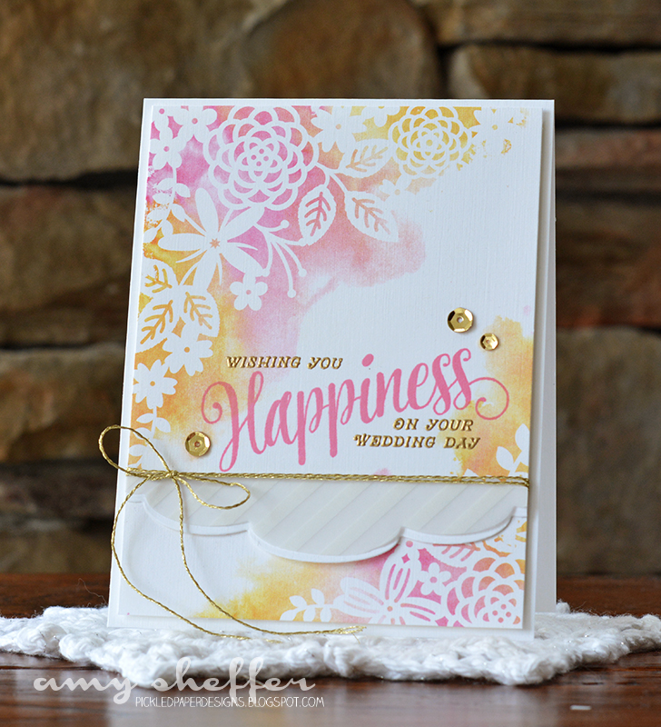
The sentiment is white embossed on vellum and layered over a few loops of white thread, then accented with gold sequins.


Thanks so much for stopping by!


Thursday, May 14, 2015

Handmade Gifts for Guys


Welcome to the third group post for Papertrey Ink's May release. Today's post is all about the guys! We know making masculine cards and projects can be challenging, so we're bringing you lots of inspiration, ideas, tips, and tricks for making those guy projects easier.

Before I get too far ahead of myself, all of the May release products will be available in the Papertrey Ink store on May 15 at 10 pm.

Nichole challenged us to re-make one of our feminine cards into a masculine card and share some tips and tricks. Here are my original and my re-make:


With the florals and sequins and pretty chicken scratch panel, the original definitely leans more feminine. I changed up a few elements and worked in the new Petite Places: City Station building for a totally different, and masculine, look.

Tips/tricks for creating masculine cards:

1. Choose a simple layout. Lots of white space here, and not too many layers.

2. Basic geometric shapes tend to work well. No fancy shapes here, just two circles and a pair of horizontal elements.

3. Avoid bling. Instead use wood veneer embellishments (stars are great) or die-cut stars, maybe some ink splatter, something metallic (I used a staple to adhere the sentiment flag), or no embellishments at all.


4. Color is often the number one factor in creating a masculine project. Primary colors, more muted tones, and neutrals all generally work well.


5. And then, of course, comes imagery and icons. Scenes are so trendy right now, and are a good gender neutral choice. Certain imagery is stereotypically male -- transportation in general, and in this case the fire truck in particular. 


For my next project, I've created some gift packaging using Petite Places: City Station.


I created a dome and used it as a tag for a plain kraft rope-handled bag. I stamped the Petite Places: City Station components to be a filling station this time, using the bright colors that you see on actual service stations. I love the hinged garage door, gas pumps, and oval sign.


The sentiment under the dome is perfect: "Hoping your day is filled with good things." For the dome backer, I layered a Tag Sale #4 die onto a Spellbinders circle die-cut. (The Tag Sale #4 die-cut isn't actually necessary, I just liked that shape sticking up at the top.)


"Filling Station" is a good fit for pretty much anything you fill your gift box, bag, tin, etc. with, but I wanted to make my "filling station" a mini bar, and so I filled my bag with miniature alcoholic beverage bottles.


I customized the gift-giving occasion with a Happy Father's Day sentiment banner, stamped with Keep It Simple: Father and die-cut with the Double Ended Banners die. The flared Soft Stone stripes behind the dome were die-cut with the Rainbow Stripes die set.


Here's more of a top-down angle, so you can see the dimension on the filling station building, which is just a tent fold secured along the left and right with liquid glue.

A couple of other fun details: the cityscape in the background was done by reconfiguring and layering True Black and Smokey Shadow skyline die-cuts from the Zappy Birthday die set. The road was done with one of the stamps from the new Plaid Builder set. Those dashed line stitches double as pavement lines when the stripe is stamped in True Black or Smokey Shadow (and the size is perfect for the Petite Places buildings).

For more Petite Places: City Station inspiration, visit Betsy and Melissa:


And visit the rest of the design team for two whole different batches of new products! There's so much coming, we had to divide to conquer :)


As always, visit Nichole for all the formal introductions, product details, giveaway info, and her projects:


Thanks so much for stopping by!


SUPPLIES

Fire Station Card:
Stamps: Petite Places: City Station, Plaid Builder, 
Dies: Petite Places: City Station, Double Ended Banners
InkClassic Kraft, True Black, Pure Poppy, Smokey Shadow
Other: stapler, wood veneer stars 
Paper: Fresh Snow linen card stock; Enchanted Evening Card Stock; Comic Strip Patterned Paper

Filling Station Gift Bag Tag:
Stamps: Petite Places: City Station, Plaid Builder, Keep It Simple: Father
Dies: Petite Places: City Station, Double Ended Banners, Rainbow Stripes, Zappy Birthday, Tag Sale #4, Spellbinders Circle Nestabilities
Ink: Tropical Teal, Summer Sunrise, Pure Poppy, Smokey Shadow
Paper: white card stock; Tropical Teal card stock; Fresh Snow linen card stock
Other: Black and white baker's twine, clear dome, miniature binder clip


Wednesday, May 13, 2015

Introducing Make It Market Mini Kit: Garden Gild


Today is the second of Papertrey Ink's May Release group posts, and we're introducing another of Betsy's fabulous Make It Market Mini Kits. This one is called Garden Gild, and it is absolutely gorgeous!

Before I get to my projects, just a reminder that all of the May release products will be available in the Papertrey Ink store tomorrow, April 15, at 10 pm EST.

Make It Market Mini Kit: Garden Gild is a beautiful kit that combines soft watercolor backgrounds, gold foiling, and a stamp with filled with florals and large script sentiments.

The Make It Market Mini Kits are always beginner-friendly while also offering customization options for more experienced stampers. My first card is super easy to create, with impressive results thanks to the beauty of the kit supplies.


I started with one of the lovely kit patterns and added a stamped sentiment. The large word "happiness" is stamped in Hibiscus Burst ink. The smaller sentiment components were stamped in VersaMark and heat embossed in gold.


I die-cut a soft scalloped border twice using the Edgers #3 die, once in white card stock and once in vellum. I adhered them to the base panel just below the sentiment. Embellishments are simple -- gold embroidery floss and a few gold sequins.


My second card is more involved, yet still not difficult at all. I die-cut a large scalloped circle sentiment one of the backgrounds using the Scene It: Basic Backer die. Behind that is a white Scene It: Doily Tag Base die-cut. 


I added two sentiment components and some aqua mist, limeade ice, and vintage cream felt flower die-cuts, as well as some clear sequins. The individual flower dies are included with the Garden Gild cutting plate. I love the layering possibilities!


The card base is aqua mist topped with some large polka dot Sheer Basics Vellum topped again with a white Garden Gild cover plate die-cut.


For more Make It Market Mini Kit: Garden Gild inspiration, visit the design team blogs:


SUPPLIES

Pink/Yellow Wedding Card:
Make It Market Mini Kit: Garden Gild
Hibiscus Burst ink, VersaMark ink, 
Sheer Basic vellum, gold embroidery floss, gold sequins

Blue/Green Birthday Card
Make It Market Mini Kit: Garden Gild
Scene It: Basic Backer die, Scene It: Doily Tag Base die
True Black ink, white card stock, Sheer Basics vellum
Limeade Ice, Aqua Mist, Vintage Cream felt
clear seqins


celebrate best. day. ever


I'm up on the Reverse Confetti blog today with this week's Wednesday in the Works segment. I had some fun getting a little messy with watercolor smooshing, splattering, misting, tearing, and embossing. Wanna see more? Visit the Reverse Confetti blog. I'd love for you to join me there!